Tuesday 8 February 2011

7: Looking back at your preliminary task, what do you feel you have learnt in the progression from it to the full product?

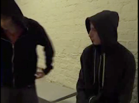
The camera work and continuity wasn't very good in the preliminary exercise.  Several characters were dressed similarly, which was confusing and showed the need to consider the role of costume in mise en scene and narrative. We broke the 30 degree rule at several points causing jump cuts such as here.


We were limited in the range of shots we used, partly because of the tight space we were filming in, although we did use a medium close up of the hand opening the door, followed by a long shot to establish location, two shots for the conversation (rather than the over the shoulder shot we should have used) and a close up of the main prop to show its significance. 


We had very little camera movement, which was something I wanted to consider in my final piece, as we had experimented with the jib and track in class and I could see its potential.

After doing the preliminary exercise I decided that working in a group was restrictive and that I had a lot more freedom if I worked independently.

When I was working on my editing for my own thriller I made sure that the cuts between the shots linked well together according to the rules of continuity editing. Originally the hardest part was linking the sequence from the driving into the courtyard shot to the man walking to the front door and into the house but I had storyboarded, which helped, and played around with the timing of each shot to make sure the rhythm of the edits worked.


Another difference is that my thriller opening has a longer narrative sequence and poses several enigmas, unlike the preliminary exercise where the narrative just consisted of some milk dealing! The fact that I have included some stills suggests a more interesting and complex narrative.

I also added a soundtrack, which really added to the whole opening, as there were particular sounds in it which linked to the narrative such as the camera shutter. The sound effects used in the soundtrack create the idea to the audience that they are looking at stills that the killer had taken. The sound track also sets up the mood for the film which is disconcerting as you get all these strange, synthesized sound effects.


I tried to incorporate some graphics and titles, which we had not used in the first continuity exercise; the image of the frog was done in photoshop over the original picture and the fonts for the film title and the credits were found in 'dafont'


I used more complex transitions in the final piece, too. The white transition between the stills gives you the effect of the camera flash as the character has just taken the photo. When I cut from the production company logo to the new line theatre logo at the beginning I made the colour dissolve a black so that it would contrast with the continuous white dissolves throughout.

I tried to incorporate both the jib and the dolly track in my thriller opening as there were two perfect places but unfortunately it didn't require the pan from the man getting out of the car as one of the jib shots did that better and could get a shot form the man walking to the door. The jib allowed me to get shots that would have been difficult to create without it, like the pan with the car coming in through the courtyard opening and the shot above the mans head when he is taking out the implements. I could have stood on a chair to do that but would have cast a shadow and ruined the lighting.




6: What have you learnt about technologies from the process of constructing this product?

5: how did you attract/address the audience?

4: Who would be the audience for your media product?

Mine is a film about a serial killer and serial killer films are big business with big, and generally quite young, adult audiences (although some of the films in this linked list may be more accurately defined as horror); in this list from Mojo the most recent film is ‘Saw 3D’ in 2010. But with more recent thriller films like ‘Inception’ (sci fi thriller), ‘Shutter Island’, ‘Unstoppable’ (action thriller), ‘The American (assassin thriller), 'State of Play' and the long running James Bond franchise, thrillers have been topping box office receipts here and in the US for the last year.  


Thrillers are generally said to have a 25-plus male audience (and horror a 17-25 male audience) but with films like ‘The Lovely Bones’ (supernatural thriller) and currently ‘Roommate’ in America, thrillers can appeal to a female audience too. Black Swan (psychological thriller) has recently had the biggest box office for Fox.  The thriller Inception was fourth on the list of highest UK box office list for 2010 – only after three big budget family films which have the bigger capacity to draw audiences, demographically, Toy Story 3, Harry Potter and the Deathly Hallows and Alice in Wonderland

Certification for a film is to protect the audience, like not showing gruesome horror to 6 year old children. The BBFC is a non-government funded company who certify not only films but games and downloadable things on the internet. I believe my thriller would be certified as a '12A' because of the content, as you can see below. When you see the tools being taken out of the rucksack later on in the opening, it gives the audience the idea that there could be violence or a bit of horror, with some short sequences of psychological or physical threat.  I also decided that later on in the film, in order to keep the narrative realistic, the police officers would be likely to use some strong language when they are trying to discover who the murderer is.


I got feedback for both rough cuts, which confirms the appeal to an older audience.


3: What kind of media institution might distribute your media product and why?

distribution

2: How does your media product represent particular social groups?

These are images of one of the two social groups that are represented in this thriller opening. These connote the innocence of children, they are helpless and we see that they are children because of what they are wearing. 


The first image is of a girl, the hoody that she is wearing says the name of her school so we know that she is under the age of 18, so still technically a child. The second image is of a young boy who is wearing a light jersey top and trainers, clearly dressed for play. The final image is of a girl who is in her uniform and so was killed on a school day. These characters are framed in a way so they look rather vulnerable, they are clearly alone and exposed; the first two are shown to be in some kind of forest because of the dirty floor and the leaves all around. The last image of the girl shows her entire uniform. They have also been moved, presumably by the killer, as they are shown in different positions and locations, which indicates they are treated as objects, something shown further by the fact he is taking photos of them after he has taken their lives.


This actor is an older character as he wears a trench-coat styled coat and a flat cap. He obviously has no time for fashion as his whole attire doesn't match. He wears white running trainers with black trousers and a polo-neck jumper with a zip with the trench-coat. The fact that he has a cheap muddy car shows that he does not particularly care for material things. His house was formally a barn with a courtyard so he lives in a rural area. From this we get the idea that he likes the quiet and doesn't want to be disturbed. 

He is filmed at some awkward angles which makes him seem even more odd: the close up of his gloved hand, the low angles he is often filmed at, how he is seen in shadow on the car or distorted through the glass:


We only have these hints to guess what kind of person he is but he seems quite clean and we see that he has some kind of OCD which we see here, later on in the opening, when he is taking out the implements, fondling them in a manner that is disturbing to the audience, and them putting them down in their own place.

1: How does your media product use, develop or challenge forms and conventions of real media products?

Thursday 3 February 2011

Creating my soundtrack

The inspiration for my soundtrack for 'Capture' came from the soundtrack for Se7en which is a remix of a Nine Inch Nails track, 'Closer'.

It uses sound effects which are partially synthesized to create an unnatural soundworld which unsettles the audience. The track for my film opening was created in Garageband using loops and sound effects, some of which were then treated with reverb and echo. It has a disturbing effect as none of the sounds can quite be identified. Towards the end of the track a more obviously musical theme comes in.


Sounds included a bicycle, packing boxes, cave water drops, radio tuning, bowling strikes, doors opening and closing, as well as synthesized strings to add tension. In the final edit, the diegetic sounds will be left to run simultaneously and these will be mixed with the camera shutter sounds downloaded from a sound effects website. I researched dozens of these until I found the one which created exactly the right sound.


These were the tracks I eventually downloaded and imported into iTunes. I decided I will use track 2 below in the final sound edit.


Monday 31 January 2011

Creation of a Production Company logo

These are some screen shots of the creation of my logo for my production company, Hopping Mad, which I created in Photoshop. I plan to add the lettering for the logo in Final Cut.


Wednesday 26 January 2011

Experimenting with Title Fonts

In Final Cut I made a few dummy sequences just for the film's title itself.


I added the sound effect of a camera shutter to synchronise with each letter coming up to reinforce the idea that 'Capture' did not just mean to capture the physical bodies of the victims but to capture their images with a camera.  I got the sound effect from Garageband and imported the file into Final Cut.  I don't think the sound is completely realistic so need to find another one or record my own. I imported a number of different fonts from Dafont,
 
as I did not think any of the fonts already installed on Final Cut fitted the image I had in mind.


Originally I was going to have a font based on retro writing from the art-deco era or from the 40's which was inspired by the film 'The Third Man', as it was set in the late 40's.


I decided that this was too girly and that it would not fit the genre of the film, so I went for a more chunky masculine look, which looked better but it would have gone better with a violent thriller.


I finally decided on an uneven typewriter font which seemed to go better with the camera theme of the narrative and signified the realism of the approach I intended


I looked at other typrewriter fonts, like Courier, but thought their lines were too clean and precise.  I thought that the look of this typewriter font was best, as it has splodges and looks untidy which gives the viewers a sense of unease.

Friday 7 January 2011

Title Fonts From Other Thrillers

The Orphan


Casino royale: James Bond


The Sixth Sense


In the first two images the typography is simple, using sans serif fonts.   The simplicity doesn't distract the audience too much from the background as the backgrounds give the audience an idea of the narrative. In the last image, the font is in serif capitals but remains simple as it is white on black.  The background isn't detailed so it doesn't give you any indication of what is going to happen.